AbyM Blog

What is Responsive Web Design? Key Benefits and Best Practices Explained

What is Responsive Web Design

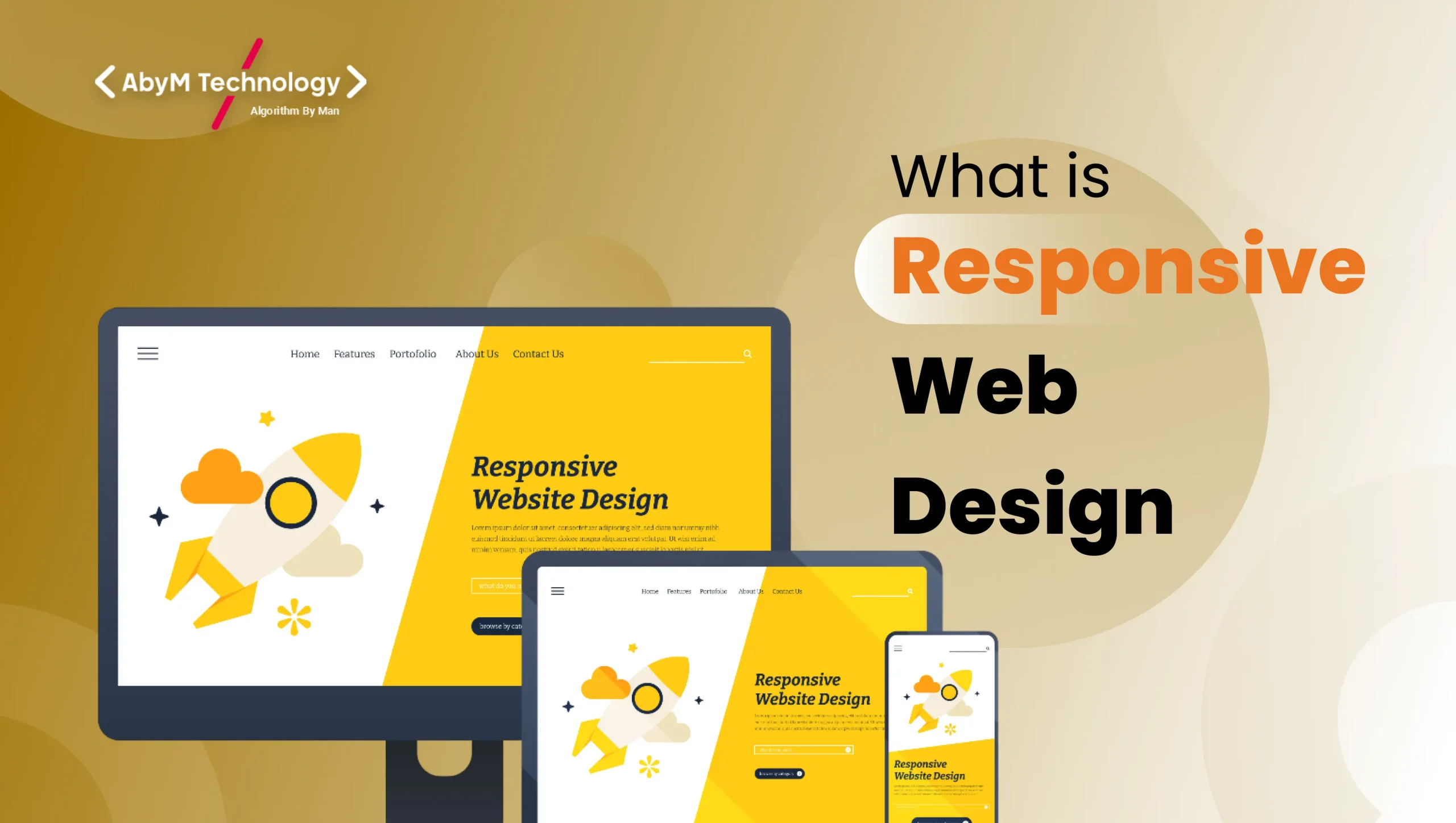
In today’s digital world, people browse the internet on everything from massive desktop monitors to tiny smartwatches. If your website looks perfect on a laptop but turns into a jumbled mess on a smartphone, you’re losing visitors—and customers—fast. This is exactly why Responsive Web Design (RWD) has become the gold standard for modern websites.

Coined by Ethan Marcotte in 2010, responsive web design is an approach that makes your website look and work beautifully on any device with a single codebase. Instead of creating separate versions for desktop, tablet, and mobile, a responsive site automatically adjusts its layout, images, fonts, and functionality based on the screen size and orientation.

Think of it as a rubber band: it stretches and contracts smoothly without breaking.

How Does Responsive Web Design Actually Work?

Responsive design relies on three core technical pillars:

  1. Fluid Grids Traditional fixed-width layouts (like 960px) are replaced with percentage-based or relative units (%, em, rem, fr). This allows columns and elements to resize proportionally.
  2. Flexible Images and Media Images scale within their containing elements using CSS properties like max-width: 100%; and height: auto;. Modern formats like WebP and the <picture> element also help serve optimized versions.
  3. CSS Media Queries The magic ingredient. Media queries let developers apply different styles based on device characteristics—screen width, height, orientation, resolution, and more.

Example of a simple media query:

    CSS
    @media screen and (max-width: 768px) {
      .sidebar { display: none; }
      .main-content { width: 100%; }
    }

    Why Responsive Web Design Matters in 2025

    Google switched to mobile-first indexing years ago. That means Google predominantly uses the mobile version of your site for ranking and indexing. A non-responsive site? You’re practically invisible in mobile search results.

    Here are the biggest benefits that make RWD non-negotiable:

    1. Improved User Experience (UX)

    A seamless experience across devices reduces frustration and bounce rates. Users don’t have to pinch-and-zoom or scroll horizontally—actions that drive 70% of mobile users away within seconds.

    2. Higher Conversion Rates

    Amazon reported that every 100ms of improvement in load time boosted sales by 1%. Responsive sites load faster on mobile (fewer redirects, optimized assets) and convert better. Studies show responsive sites enjoy up to 67% higher conversion rates on mobile.

    3. Cost and Time Efficiency

    Maintaining one responsive site is dramatically cheaper than managing separate desktop and mobile versions (or worse—a clunky m.dot subdomain).

    4. Better SEO Performance

    Google loves responsive design. Benefits include:

    • Single URL (avoids duplicate content issues)
    • Faster load times (Core Web Vitals)
    • Lower bounce rates
    • Mobile-friendly label in search results

    5. Future-Proofing

    New devices with foldable screens, vertical monitors, and ultra-wide displays appear every year. A well-built responsive site adapts without requiring a redesign.

    Best Practices for Building a Truly Responsive Website

    Follow these proven practices to create a fast, accessible, and user-friendly responsive site:

    1. Start with Mobile-First Design

    Design for the smallest screen first, then progressively enhance for larger viewports. This forces you to prioritize content and functionality.

    CSS
    /* Mobile styles (base) */
    .container { width: 100%; padding: 1rem; }
    
    /* Tablet and up */
    @media (min-width: 768px) {
      .container { max-width: 750px; margin: 0 auto; }
    }
    
    /* Desktop and up */
    @media (min-width: 1024px) {
      .container { max-width: 1000px; }
    }

    2. Use a Flexible Grid System

    Frameworks like CSS Grid and Flexbox are perfect for responsive layouts. Bootstrap and Tailwind CSS also offer excellent responsive utilities out of the box.

    3. Optimize Images Ruthlessly

    • Use srcset and sizes attributes
    • Serve WebP/AVIF formats
    • Implement lazy loading (loading=”lazy”)
    • Consider using modern <picture> element with art direction

    4. Prioritize Performance

    • Minify CSS, JavaScript, and HTML
    • Use CSS instead of JavaScript for layout changes when possible
    • Leverage browser caching and CDNs
    • Aim for Largest Contentful Paint (LCP) under 2.5 seconds

    5. Design Touch-Friendly Interfaces

    • Buttons at least 44Ă—44 pixels
    • Adequate spacing between tappable elements
    • Avoid hover-only interactions on mobile

    6. Test on Real Devices

    Emulator testing is helpful, but nothing beats real-world devices. Tools like BrowserStack, LambdaTest, or simply your own phone collection reveal quirks simulators miss.

    7. Make Typography Responsive

    Use relative units (rem, em) and fluid typography techniques:

    CSS
    h1 {
      font-size: clamp(2rem, 8vw, 4rem);
    }

    8. Don’t Forget Accessibility

    • Maintain proper color contrast
    • Use semantic HTML
    • Ensure keyboard navigation works
    • Add proper ARIA labels

    Common Responsive Design Mistakes to Avoid

    • Using fixed pixel widths for containers
    • Hiding important content on mobile instead of re-arranging it
    • Overlooking landscape orientation on phones
    • Serving huge desktop images on mobile
    • Relying solely on JavaScript for responsive behavior

    The Bottom Line

    Responsive Web Design is no longer optional—it’s the foundation of professional web development in 2025. A responsive website delivers better user experiences, higher engagement, improved SEO rankings, and stronger conversions while saving you development time and money.

    Whether you’re building a personal blog, an e-commerce store, or a corporate portal, embracing responsive principles ensures your site will look stunning and function flawlessly for every visitor, no matter what device they’re holding.

    AbyM Technology

    AbyM Technology is a leading IT and digital solutions company offering premium website development, mobile app development, software solutions, and digital marketing services. With over a decade of expertise, we help businesses grow through innovative technology, creative design, and result-driven strategies. Our team specializes in building responsive websites, user-friendly mobile apps, and effective SEO, social media, and branding solutions. At AbyM Technology, we focus on quality, timely delivery, and complete client satisfaction.

    Categories

    Subscribe to Our Blog

    Related Post

    Other Related Articles